Thursday, April 30, 2020

Getting Bored of People Stating the Obvious

"Unprecedented", "things will never be the same", "Covid-19 is a deadly virus", "these are uncertain times", "wash your hands", "the safety of our customers is our highest priority" - I am getting fed up hearing people stating the obvious. We already know all this - but why do people online, in meetings, in calls, in the media feel the need to say this stuff over and over? 

Also, there has been an increase in the level of moaning about what will happen after the lockdown is ended. Nobody knows for sure, but that doesn't stop some people falling onto a "What have the Government ever done for us" trance.

Here's an example from yesterday's Irish Times, where Éanna Ó Caollaí and Carl O'Brien report that "University lecturers warn of ‘enrolment chaos’ in autumn". Like - has no one in the Department of Education not already thought of this? The Irish Federation of University Teachers (which I am not a member of) is warning us that the Government must begin consulting with colleges, staff and students in order to avoid escalating uncertainty and the threat of “enrolment chaos” in the autumn, and that students and university teachers are being left in an “ongoing limbo” amid the uncertainty caused by the coronavirus pandemic.

Well d'uh!

Universities and Colleges are already aware that there is a pandemic on - I know this 'cos I work in one. Ó Caollaí and O'Brien do report in their article there are actually discussions taking place. I know that in my own College that several discussions and projections have already taken place. Yet - we have to endure more warnings stating the obvious that something must be done. IFUT is demanding that they need clear and detailed discussion on a roadmap from Government on issues like when and how colleges will be allowed to reopen in a time when we have an interim Government who not surprisingly are focussing on saving lives.

Rant over.

Wednesday, April 29, 2020

Assignments replacing exams

So far, I'm not a big fan of the situation that Covid-19 has forced us all into replacing end of semester  exams with assignments/projects. Exams designed to assess learning outcomes are not being used, and it has not been easy coming up with replacements in the form of an assignment to to the same thing. Add in the fact that we had to create replacement assessments in a short time, I feel as though this situation is not ideal. But, it is-what-it-is! 

Replacing exams with assignments has an impact for educators grading them. It takes a lot longer! Most students will write between 8 - 12 pages during a two hour exam. Some who perform badly in an exam, may only write a few pages - these scripts take just a few minutes to grade. Very few will write 20/30/40 pages. But this is what I am getting with the replacement assignments - and the time taken to review and grade is very lengthy. This will inevitably put pressure on deadlines for us to get results published. 

No doubt there will be a sector review of assessment. Simply substituting an assignment (which we have had to do for obvious reasons) for an exam is a crude mechanism not designed for assessment. Assessment needs to be carefully planned regardless of whether it is an assignment or an exam. Students should be assured that no matter what mechanism is used, they are being assessed in a fair and sure manner. 

Friday, April 24, 2020

What Flattening the Covid-19 Curve is Starting to Look Like

Data published daily by the European Centre for Disease Prevention and Control allows us to examine Covid-19 data ourselves - Data Democracy in action! There has been much talk over the past few weeks about "flattening the curve", and how important following the HSE's guidelines on staying safe can help to do this. We are all praying and hoping that the feckin' curve will revert to zero quickly, but flattening also means that we prolong the infection. 

I think we can at last see evidence that the curve is flattening. Here's a bar chart showing daily reported new cases in Ireland since 1st March when the first case was reported here:

Click/Tap to Enlarge.
While the curve is not smooth, we can definitely see the slow growth in the number of cases since the first one was recorded, followed by a downward trend over the past few days. However, yesterday's new cases figure (631) bucks the trend and shows us how easy it is for the curve to start to go up again. Based on the shape of the curve above, it will take at least 3 to 4 weeks more from today before the curve reaches less than 200 new cases per day. A sobering thought given cries for the lockdown to be eased on 5th May!


Thursday, April 23, 2020

Last Class of Semester

It's always a weird feeling when I reach the last class in a semester. Last evening I held my final class on the "Programming for Big Data" module which is part of our on-line Higher Diploma in Data Analytics course. This course was delivered on-line from the beginning, so it is not one of our courses that had to switch from the classroom to on-line. 

Finishing up a module is always tinged with a little sadness for me, especially at the end of the academic year. In most cases it means that I will not see students again, I do like to get to know them throughout the semester. Finishing a semester in April also usually means for academics that their next class is in September - five months away! The next 6-8 weeks are really busy ones with grading and Exam Boards - so no slacking allowed yet.

This semester was my 36th at the National College of Ireland, and perhaps with the Covid-19 crisis to deal with, it was a semester like no other. For the last five weeks of the semester, I and my students have not set foot in the College - all our dealings have been on-line. Traditional barriers like 9 to 5 availability are broken and gone - hopefully forever. Working from home has meant that I have started work some mornings before 07:00, done work on Saturdays and Sundays, finished early or late, and taken lunch breaks longer that an hour. Never before have I had my work email open at all times (I use Outlook for this, and Gmail for private mail) - usually I used to try my best to keep the distinction between the workplace and home. There's no such distinction any more. 

We can only speculate if next September will see a return to what we had before. Will we be able to pack students into a classroom or computer laboratory if social distancing is still recommended? Many lessons will have been learned over the past few weeks about Learning and Teaching in third-level. I can only hope that we learn from these lessons.

Semester II is dead, long live Semester I.

Monday, April 20, 2020

Where to find the Johns Hopkins Covid-19 Datasets #Analytics

The data repository for the 2019 Novel Coronavirus Visual Dashboard operated by the Johns Hopkins University Center for Systems Science and Engineering (JHU CSSE) is freely available at Github. JHU have become one of the Go To places on the Internet for information and data on Covid-19, and they have some wonderful dashboards and data visualizations. Lots of my data analytics students will naturally be interested doing projects on these types of data - looking for links, trends, patterns, relationships, and to build models to make predictions and classifications.

This is Data Democracy in action. Data gives us insight, and insight in turn gives us foresight, which we can act upon. I am absolutely convinced that data analysis is helping greatly in the fight against Covid-19. Together with scientific research into treating the disease and efforts to find a vaccine - data has a vital role to play.


Sunday, April 19, 2020

How To... Plot Covid-19 Cases and Deaths as Two Lines on the Same Chart

Like a lot of people I have been looking at some of the impressive charts and diagrams related to Covid-19 in the papers - epecially The Irish Times. The Time used Datawrapper to plot its charts, so I wondered how to do some of them in Excel. The chart show rising cases and rising deaths is easy to draw- once you get the knack of selecting the right data. So I made a quick video on how to draw the chart with two lines, and posted it to YouTube. Here it is...

Thursday, April 16, 2020

Four Weeks Out of the Office #wfh

It's four weeks exactly since I last set foot in my office in the College. Even that was just to collect my folders of notes so that I could deliver my remaining classes on-line from home. Now four weeks later, with at least three to go before I get back, I am missing a lot of the daily interation with students and colleagues. It is feeling more distant with each passing day. 

We are currently in the Easter Reading Week - our last week of semester II takes place next week, as welcome an end-of-semester as ever there was. However, in a month's time we will be starting semester III and we will be planning for that soon. We are also gearing up for grading assignments and projects instead of exams which will be due in over the next few weeks. 

I made a video for the NCI Marketing Department a couple of weeks ago, as part of a series with some of my colleagues, showing off my home office. This is where I am spending most of my time. It is at the front of my house and I am slowly turning into the neighbourhood watch as I see everything that happens outside on my street. 

Thursday, April 09, 2020

Interesting Dataset from 1693 #Analytics #Data

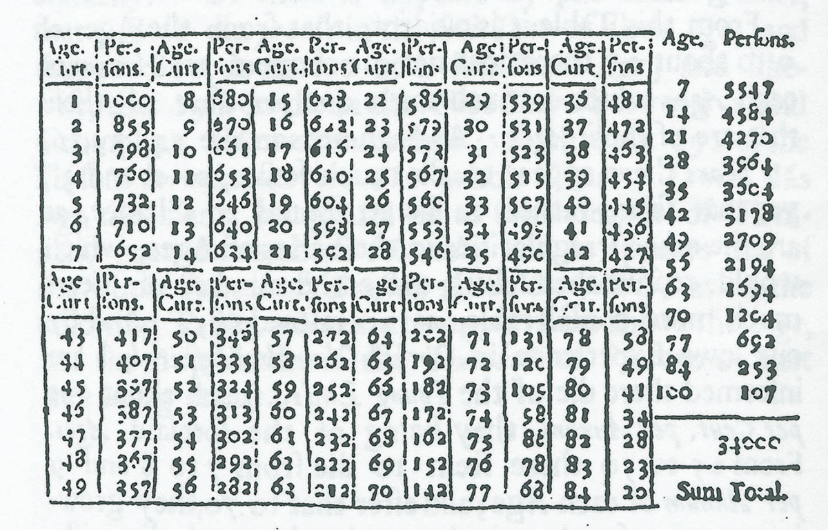
While attending a Data Analytics Institute Inspire on-line event this morning, I was particularly interested about a very old data set in the form of a Life Table. One of the presenters used this as part of the introduction. In 1693 Edmond Halley, he of Halley's Comet fame, created a life (population) table. It was based on data collected for the years 1687 - 1691 from the city of Breslau, which is now called Wrocław in Poland. The data that Halley used were the numbers of births and deaths recorded in the parish registers of the town. He was interested in debunking some superstitions about multiples of 7 - apparently people feared reaching the age of 63 (9 x 7) as it was thought to be an age at which you were more likely to die.

Here's what the original table looked like:

Edmond Halley.
Image source:
New World Encyclopedia

Wow - this is from 1693, Data Science was in its infancy! In 2011, David Bellhouse wrote a paper taking "A new look at Halley’s life table", which explains among other things how Halley used to round numbers and that the original data set is no longer available. You can see that every age from 1 to 84 is listed, and that they are presented in groups of seven. For R programmers, this dataset is available in the "HistData" library - here's the code to load the data and plot "Age" against "Persons Surviving" in stair steps format, and a plot showing the probability of surviving one more year:

library("HistData")
data(HalleyLifeTable)
#
plot(HalleyLifeTable$age, HalleyLifeTable$number, 
     main = "Halley's Life Table",
     xlab = "Age", ylab = "Number surviving",
     type = "s")
#
# Conditional probability of survival, one more year
plot(ratio ~ age, data=HalleyLifeTable, 
     main = "Halley's Life Table",
     xlab = "Age", 
     ylab = "Probability survive one more year")

The code above generates the following two charts:

Nice to be able to examine a dataset that is 327 years old!


Bellhouse, D. R. (2011) A new look at Halley’s life table. J. R. Statist. Soc. A 174, Part 3, pp. 823–832

Halley, E. (1693) An estimate of the degrees of mortality of mankind, drawn from the curious tables of births and funerals in the City of Breslaw; with an attempt to ascertain the price of annuities upon lives. Phil. Trans., 17, 596–610.

Wednesday, April 08, 2020

Using Spare Time During Lockdown

April 2020.
Last summer I got my brother Joe to cut a slice of wood from an oak tree taken from  my Dad's farm in Ballingate, Co Wicklow (where I grew up). The plan was to turn this into a coffee table for my daughter Vicki. I had never done anything like this before. The photo to the right was taken today, while the one below was taken 9 months ago in July last summer. During the fine summer holidays I spent quite a bit of time sanding it down. The timber was not completely dry, so I left in in a dry place - this caused it to crack and warp slightly. I stopped the warping by putting lead weights on top - and left it like this for most of the winter.

Throughout the winter I watched loads of YouTube videos on how to deal with cracks - there are literally hundreds showing you how to fill them with resin, which is what I ended up doing. I had to learn how to mix and pour resin - but I made quite a mess doing this (it leaked everywhere). Once it hardened it was back to sanding - lots of it. These past few weeks I was able to use my Covid-19 extended spare time to do this. Eventually yesterday I was satisfied and I painted it with Danish Oak Oil to shine it up a bit. Then I added legs (taken from another table), and et voila!

The location where the 100+ year old oak tree was felled was once part of the Coollattin Estate. Oaks from this estate were famous - it was the last native oak forest in Ireland. The estate supplied oak for the English fleet, the Stadt House in Amsterdam, Westminster Hall, Trinity College, and St Patrick's Cathedral in Dublin (see: A wonder of nature in Wicklow). I have taken many acorns from the ground near this tree and planted them successfully to replace trees like this we have felled. I am quietly pleased with myself and am happy with the result. The only problem now is that I can't travel to get more timber!
    July 2019.


Saturday, April 04, 2020

Working from home and the #NCIstayathomechallenge @ncirl @NCISport

A bit of light-heartedness never hurt anyone and the good folks NCI Sport started out to check on the College's student and staff on how they have been keeping active during this Covid-19 crisis. Check the #NCIstayathomechallenge hashtag and you see super contributions from many students as well as my academic colleagues @cormackd and @derbrad - both issuing challenges to me. I decided to make my own contribution, though it is not in the least sporty. I have not been out for a ride on my bike for three weeks, and I miss it terribly - so I had to find a way to fit it into my video.

For fun only, and not my real home office...

Friday, April 03, 2020

Covid-19 Data Sets #Analytics #Covid19

It has taken a while, but data on Covid-19 is now becoming available. While a huge amount of data obviously already exists, availability has been a different thing. Data scientists everywhere are itching to get their algorithms on these data. As stated by Jeni Tennison writing in The Guardian yesterday: "Wherever we look, there is a demand for data about Covid-19. We devour dashboards, graphs and visualisations. We want to know about the numbers of tests, cases and deaths; how many beds and ventilators are available, how many NHS workers are off sick. When information is missing, we speculate about what the government might be hiding, or fill in the gaps with anecdotes".

Now there are several sources - here's a selection that I am aware of:

Tableau
Trusted Coronavirus (COVID-19) global data from our community experts

Kaggle
Search results for search in data uploads

World Health Organisation
Database of publications on coronavirus disease (COVID-19)

UK Office of National Statistics
Registered deaths (only published on a weekly basis, and with a delay)

Citymapper 
Mobility Index using Citymapper App

1Point3Acres
Fill out a request to access their data which is aggregated from other courses

COVID-19 ITALIA
The Italians have been publishing data on Github since the beginning of March (in Italian)

The Irish Times
No data published, but excellent Corona Virus Dashboard

Sciensano
The Belgians have been publishing data at Sciensano on cases and deaths, broken down by gender and age group, and numbers of people in hospital, ICU, and receiving respiratory support

Happy data analysing everybody!

Wednesday, April 01, 2020

Why is Median Age More Important than Average Age? #Statistics #Analytics #Covid19

By the end of the Covid19 crisis, we will all become more data literate. Every day new figures are being thrown at us and we are learning new terms and expressions such as "flattening the curve". Today I want to give attention to the word "median".

The median is a measure of central tendency - it is the middle value of a data set when it is ranked from lowest to highest (or vice versa). In other words, half the values in the data set are higher than the median, and half are lower. In a normal distribution of data, the median will be the same or similar to the mean (average). In 1955, R.R. Sokal and P.E. Hunter (who obviously had nothing better to do) measured the wing lengths of 100 house flies (in 0.1 mm). They found that when they plotted the results in a histogram - they had shown an almost perfectly normal distribution, which educators in statistics have been using since as an example of a perfect normal distribution. In this data set, the mean (average) is 45.5, and the median is also 45.5 - here's what the distribution looks like:

Data source: Sokal & Hunter (1955)

Now let's take a look at some Covid-19 data. We are hearing a lot about the median age of death of Covid-19 victims - why not use the mean (average)? First, let's take a look at the distribution for the ages at death of 32 males and 16 females in South Korea:

Data source: DS4C: Data Science for COVID-19 in South Korea.

You can see straight away that the shape of the histogram differs a lot from the house fly data above. This histogram tells us at a glance that more older people are dying from Covid-19 than middle aged or younger people. The mean (average) age at death is 73.6, but the median age is 75 - a good bit higher. The median gives us a clearer picture of age at death than the mean. If you use the mean as an indicator, it gives a false picture. You can see in the histogram above that the shape is skewed by one person under 40 - this one value alone lowers the mean, but has very little impact on the median.

If you would like to learn more about median values, check out my YouTube video below:

Monday, March 30, 2020

Kurtosis, and flattening the curve #Statistics #Analytics #Covid19

Covid 19 has thrown up lots of new concepts that many people will not have heard about before. There has been much mention of "flattening the curve" in the hope that doing so will ease the burden on hospitals with a lesser surge of cases.

Well - there is a name for the shape of a curve: Kurtosis. It is also a descriptive statistic, a value of zero indicates a normal distribution (the middle curve below). Any deviation from this can be measured with kurtosis. A high positive value indicates a peaked, or leptokurtic, curve. A high negative value indicates a flattened, or Platykurtic, curve.

Image Source: ResearchGate.

Increasing the sample size often compresses and narrows the curve, making it more peaked. So part of "flattening the curve" in the current crisis is all about keeping the number of cases down. You can see from above that this results in a wider as well as a flat curve, making the duration longer. 

Sunday, March 29, 2020

First Full Week of On-line Classes - How was it?

Phew! Last week was my first ever doing all my classes on-line. Many colleagues have done the same, and from those that I have been in contact with - all seems to have gone well. It is a major achievement for everybody to turn around from delivering classes in lecture theatres and computer laboratories, to a totally on-line environment - all in just one week. Adobe Connect and Microsoft Teams, with a lot of help from Moodle, are the main tools being employed. In a short while, education is being revolutionized - I fervently hope that we do not go back to the way things were, and instead start to make use of more on-line learning and teaching.

Last week flew by, and I'm sure I am not alone in wondering what day it is. It is Sunday afternoon as I write this and I am taking a break from grading assignments. There is no structure to my day any more, so it doesn't seem to matter when I do things. I do have a timetable to adhere to for the next three weeks - so at least there is something regular for me. Going back to 9 to 5 will not be the same again - I certainly feel that I could do a lot more of my work at home. I do miss my colleagues and the chats in the corridor and staff canteen. The College is always buzzing with activity, and I miss this too. As the College has made the decision to finish out the semester on-line, there will be many students that I will not see again, and I am a bit sad about that.

For our 4th year School of Computing students (I have this class for Statistics) this coming week is their last in College. Their world has been turned upside down from just a few weeks ago when they could confidently look forward to a career in IT, to a very uncertain future indeed. I feel for them - I have just two more classes with them. There will be lots of new opportunities as a result of the current crisis - some optimism I hope.

Wednesday, March 25, 2020

One of the Lucky Ones #wfh

Being able to work from home is a blessing in the current crisis, and I am one of the lucky ones to be able to continue working (and getting paid to do it!). I am also lucky that where I live, there is fantastic broadband speed. Added to this is the fact that I have been teaching on-line for the past two years. Converting all classes to on-line learning has been relatively straight forward. 

I'm hearing a lot on the radio and from newspapers about efforts by educators everywhere to get classes for their students on-line - not all are as lucky as me. It will be a huge transition for teachers/lecturers at every level to get the School/College academic year completed. Yet when all of this is done, educators everywhere will be tooled up in the latest technology. Pedagogy will be revolutionalized as we all realize that what we have been doing in the classroom for years can be done just as easily and effectively on-line. We will ask questions about the need for students to attend classes in lecture theatres and labs for a small, medium, large, or all parts of a course. As the population grows, and there is a need for more places at schools and colleges - perhaps the solution to shortages is right in front of us?

Will this be the lecture theatre of the future...

My Home Office Set Up.

Tuesday, March 24, 2020

Declining Views - Top Five Countries

The United States, India, Phillipines, UK, and Canada account for 60.9% of all views this year on my YouTube Channel. As I posted yesterday, there is a sharp decline visible in the number of views over the past two weeks - and I was quite surprised by this. Could it be related to the Covid 19 crisis? 

I decided to dig a little deeper into the decline in views by Geography, and was surprised to find that the decline started earlier than I had thought. In the chart below from YouTube Analytics, you can see the peak views for the blue line (USA, 24.4% of views) was in mid February:

Click/tap image to enlarge.

From mid February there is a gradual decline by week - almost halving the number of views for the US. The green line (India, 18.5% of views) doesn't start to decline until mid March - but is dropping now too.

I have no insight into why this is happening - there are many possiblilites. Obviously, people could simply be choosing not to view my videos anymore, YouTube may have made modifications to the algorithms that recommend videos, I still have a warning on my channel for violation of terms, and some of my videos are getting quite old now. One thing that I feel may be a reason is that all over the world Colleges are dropping exams and replacing them with assignments/projects. Suddenly the requirement to perform something like a t-Test and many other calculations during a two hour period in an exam hall no longer exists. I know from comments in the channel that many students use my videos to prepare for exams - this pressure is now gone.

Whatever the reason, I hope that the channel can bounce back. It is ironic that the number of views for my existing on-line material is declining when at the same time I am switching all my classes to the on-line environment.

Monday, March 23, 2020

Sudden Fall Off in YouTube Views

I'm sure that there are many side effects of the Covid 19 crisis, and one for me is the rapid decline of YouTube views last week. Usually there is a gradual increase each week from the beginning of January up to month of May before dropping off slighly for the summer. The overall performance of the channel this year has been less than last year, but the regular patterns of weekly views and gradual increase was maintained. Until last week.

The chart below of views since 1st January. The gradual weekly increase reversed slightly two weeks ago, but last week it dropped by an average of about 2,000 views per day. I did not expect this at all, in fact I would have expected views to increase. More details tomorrow on the geographic breakdown of the data below.


Tuesday, March 17, 2020

Reading Week Relief

Never was a week free of classes so welcome. Even though our St Patrick’s Day is more like a Doomsday, it too is a welcome break for everyone in Ireland - for one day at least we don’t have to worry about going to work.

Reading week offers students an opportunity to draw breath after 8 weeks in a busy semester. We have another Reading week after Easter - more welcome relief before the last week of the semester. It is a time for students to work on assignments, catch up on essential reading, study for exams, meet with project supervisors, and revise. For Faculty it is also a welcome break from class - most of the time during Reading week spent by me is on grading assignments.

For many students, study at College will be the last thing on their minds, or at least it will be way down their list of priorities right now. While it might be tempting to give up and drop out, I would encourage students to hold fast and finish out the semester as we are so close to the end. Many students may be considering deferring completion, and Colleges everywhere will have to consider this possibility and allow it. Many Colleges are in the midst of replacing exams with projects/assignments - this should make it easier for students to complete their studies.

Image Source: Reddit.
Most third-level institutions can continue to function using virtual classrooms - next week all my classes will be conducted through Adobe Connect virtual classroom software. This facility is not available to all Lecturers. Some colleagues are planning to record lectures, others plan to use voice-over PowerPoints, some will use Microsoft Teams, while I’m sure that many will not be in a position to provide a technical solution due to broadband/home computer issues, as well as lack of knowledge/training on how on-line classrooms work. It will not be easy for everyone to switch from a lifetime of standing in front of students in a lecture theatre, to suddenly switch to on-line delivery.

Please note: Views expressed in this blog post are entirely my own personal views, and not those of NCI or any other academic institution.

Friday, March 13, 2020

Making the Switch

This morning I had my first on-line class in a module that is usually delivered in a classroom. Attendance was excellent, and all students who tuned in were able to see and hear what I was doing. I used the familiar Adobe Connect and all its feature - my students seemed happy enough at the end of class. My five year old home computer stood up to the task very well.

The College closed at 18:00 yesterday, but some quick-off-the mark lecturers were in a position to deliver their regular classes online at 18:30. I will be moving all classes online for the remainder of the closure, which I predict will be extended into at least after Easter. I also attended a training session this morning on the use of Microsoft Meetings. While it seems like an excellent tool, I'm sticking to Adobe Connect. At minimum, we are advised to make sure all learning resources are added to Moodle and to be available during class time for questions.

So that's the first day of the closure over. We have a Reading Week next week, so no classes anyway. But I'm confident that I can continue the week after on-line when classes resume. It will be an interesting research topic for when this is all over to see how College closures impact on learning and teaching.

Please note: Views expressed in this blog post are entirely my own personal views, and not those of NCI or any other academic institution.

Thursday, March 12, 2020

Covid-19 - a Breakthrough for Technology in Education? #CoronaVirus

There is already a lot of Technology in education - we have become so reliant on it that most of us can no longer envisage learning without some kind of technology in the classroom. Despite some setbacks (eg, see: Co Meath school to reverse iPads-only policy after review), students everywhere are using their computers for learning. There's no going back on this.

With some Schools and Colleges already closed, and I'm certain - more to follow, the use of technology to replace face-to-face classrooms is on the agenda as we struggle to contain the Covid-19 virus. I'll only comment on the third level sector, as this is where I work. We of course use the likes of Moodle and Blackboard to manage content such as lecture notes, sample assessments, exercises, model answers, and links to relevant on-line material. But lecturers everywhere are wondering about or asking questions about virtual classrooms and how to use them. Since I already teach one of my modules on-line - I feel that I could easily move my other modules on-line for the rest of the semester. I may have to make different arrangements for students who do not have broadband access, but this may not be the problem it once was. I use Adobe Connect, which is excellent for on-line delivery of a class. A warning to others thinking that just because an old guy like me can do it, how tough can it be! Also a warning to educational institutions' management who think that moving everything on-line is the solution to the current crisis.

It is two years since my first on-line class and I am still learning the trade. From a Learning and Teaching point of view, it is a very different environment than the classroom. Way back in 2003, Morten Flate Paulsen*, Professor at Sør-Trøndelag University College in Norway, was one of the first scholars to research the distinction between on-line and classroom education. A simple summary of what he wrote to compare the two types of education:

Classroom Education:
  • Controlled by “bell”
  • Boundaries are socially accepted

On-line Education:
  • 24 x 7 x 365
  • More demand from students
  • Heavier workload for on-line teachers

In short, on-line education has a heavier workload than the classroom equivalent. Paulsen proposed the following strategies to reduce teacher workload in on-line education:
  1. Form a group of experienced and well-trained teachers
  2. Establish a system for technical and administrative support
  3. Shift attention from spontaneous interactive teaching to deliberate course design
  4. Pay special attention to the assessment workload per student when designing course assignments
  5. Restrict teacher interaction with individual students and small groups of students
  6. Encourage and facilitate interaction among students
  7. Automate response
  8. Develop a scheme to handle the demand for expedient responses
Sound advice indeed! However, we have to consider that we are two thirds of the way thought the last semester of the academic year and there is not the time, resource, or knowledge to implement above (written 17 years ago). We are also in the middle of a crisis (though not all education authorities see this yet) and we must put our students' learning first. Most will be understanding of the difficulties Colleges will encounter, and be sympathetic of our efforts to finish courses. But many (if not all) are already concerned about finishing modules and sitting exams. They are waiting.


Please note: Views expressed in this blog post are entirely my own personal views, and not those of NCI or any other academic institution.


* Paulsen, M.F., (2003). Online education: Learning management systems - Global E-Learning in a Scandinavian Perspective.


Tuesday, March 10, 2020

Moving Lectures On-line #Covid19

News today that Trinity College are to move all lectures to on-line delivery (see "Trinity cancels lectures in bid to limit coronavirus threat" seems like a very sensible move given the threat of the Covid 19 spreading to Staff and Students. Other Colleges have  yet to follow suit - I feel that it is inevitable that lecture theatres will have to close, and a question placed over other large gatherings such exams and graduations. Already, both ourselves (NCI) and DCU have cancelled Graduation ceremonies due to be held next week. 

So - will transferring all classes to an on-line virtual classroom work? We are only four weeks away from the end of the academic year - should we do it?

For me I think I could cope quite well as approximately 25% of my teaching is done on-line already - so I am familiar with the technology. Some content and class dynamics will need adjustment, but as we are well in to the second half of the semester - this should not be a huge workload. I find that transferring a lecture which involves simply reading slides (already a major bad teaching strategy), to reading them online will not work and will definitely not engage students. Anyone who thinks that delivering a class on-line is the same as in a lecture theatre has not thought this through. Many Faculty who have never delivered a class on-line (the vast majority of Faculty in my view), will naturally be concerned about how this works and the effect it will have students' learning. It is better than no classes, and in most cases Colleges will have to make do with what they've got - I'm certain that students will be understanding if this all happens. These are difficult times, and we in the Education sector have to do our bit in the fight against this virus.

Please note: Views expressed in this blog post are entirely my own personal views, and not those of NCI or any other academic institution.

Thursday, March 05, 2020

TV Licence costs over the years #TimeSeries #Data

I got my bill the TV Licence today - €160 for the year is not cheap, but I pay it anyway. It got me thinking about how much this fee tax has cost me over the years. In 1986 when Roma and I first moved into a house together and got our first TV Licence bill, we decided to pay it. It was just as well because shortly afterwards we got the dreaded knock on the door from a TV Licence inspector. Luckily we were able to show our newly acquired licence. In the 34 years since we have not been visited by any more inspectors.

In 1986, the licence fee was £62.00 (€78.74). You can see below the trend in cost over the years:

Data source: Wikipedia.

We can also see that there were periods of stagnation over many years - the fee tax has been €160 since 2008. By my calculation I have paid a whopping €4,371.30 for a TV licence since 1986. of course this is after tax, so I would have had to earn around €6k/€7k to pay this. Is it worth it? 

The licence is free to those who are 70 or over - just 10 more years to go for me (and another €1,600 or more). 

Saturday, February 29, 2020

40 Years Ago

The blurred photo below is from 28th/29th February 1980 - the occasion is the Trinity College Pharmacy Student Ball. In front in the white shirt is a 20 year-old beardless Eugene who has removed the jacket and bow tie from his tuxedo - he was a 2nd year Science student in Trinity. My glazed eyes are possibly from having smoked a joint! On the left is the ever lovely 18 year-old Roma wearing my bow tie - a 2nd year Pharmacy student, it was our first ever date. Nobody could have told us then what would happen in the next 40 years.


Still mad about you.

Tuesday, February 25, 2020

Last time at the Blood Platelet Clinic - Thanks @GiveBlood

Receiving an award from then
Health Minister Leo Varadkar. in 2015
A sad day for me today in that I will no longer be able to donate blood platelets at the Irish Blood Transfusion Service Clinic in St James's Hospital. My platelet count has been too low for several visits to the clinic in a row. I have been going there for several years and finished up with 155 donations, with a Silver Pelican, Gold Pelican, Gold Drop, and a Pelican Statuette (from Health Minister Leo Varadkar). There is now one donor less in this Clinic - I would encourage anyone who is interested in becoming a donor to try it out.

I will miss the camaraderie in the platelet Clinic - I have known some of the staff for several years. It was a bit of a wrench leaving there today. Thank you to all the staff, I do hope that my platelets were used to help people in need over the past few years. 

I will return to the whole blood register next time, it is only possible to donate 4 times a year (compared to 12 times per year for platelets). I hope to get a few more donations under my belt.

Good Bye Platelet Clinic!

Thursday, February 20, 2020

Assessments taken on-line

I had a really interesting experience the other evening when a colleague took over part of my on-line evening class to establish the ground for the students to take their tests online. At NCI we use a proctored system called RPNow, which basically records everything a student does if they take the test remotely. It makes it easy for us to detect if anyone is cheating, and therefore protects the integrity of our assessments. However, it can be a bit daunting for students to take a test like this for the first time. We gave the students a short mock test during the class - some completed it in 5 minutes, while others experienced a lot of technical difficulties and didn't even get to start the test after an hour.

All this begs the question: "Should students take proctored tests on-line?".

Let's first take a step back. The primary purpose of assessment is to “foster learning of worthwhile academic content for all students” (Wolf, Bixby, Glenn, & Gardner, 1991). In the year 605 AD, Imperial China introduced a strict system of assessment officially called the “Imperial Examination”, which was better known as “The Forest of Pencils”. This tough examination was designed to select the best administrative officials for the empire’s civil service. This assessment was found to be the best way to recruit civil servants – the best people were selected according to results, bribery and corruption were moved aside (Buckley Ebrey, 2010). Assessment has been part of education for centuries – there is no escaping it. So today should be no different?

It should be noted that most students are going to pass exams anyway. In the normal distribution below (Kashyap, 2019) you can see that less than 7% of students fail (F grade). Of course not all grading results in a bell-shaped curve like this, but it gives you a breakdown of what to expect. So if we know that 93% of students are going to pass, why bother with tests? For on-line students, why bother with tests with the added pressure of ensuring technology is working?

Image source: Ravi Kashyap.
In courses that I am involved with, most marks come from Continuous Assessment. For on-line courses, I feel that a good case can be made for assessing all Learning Outcomes with continuous assessment, and assignment/project work. I know that a lot of programmes do this already - right up to Masters level. Something for us to consider with new and updates to NCI programmes.

Thursday, February 13, 2020

Election Poster Talk with @JoeCostelloIE

I bumped into Joe Costello of the Labour Party while out walking on East Wall Road this lunchtime and I decided to chat with him briefly, and he was gracious enough to do so. In what must be a sad and partly humiliating task for any defeated election candidate, he was taking down his own election posters, including the poster ties. Good stuff Joe! 

I mentioned to him that I had written to the Irish Times many years ago (2008) about this very topic. Joe was very supportive of the idea of colour coded poster ties, and he told me that Dublin City Council are actively considering such a move. He informed me that there is a €150 fine per poster if not taken down within a week of the Election, but no fine for poster ties. Clearly it is easy to identify who is responsible for a poster, but poster ties not so as they all seem to be either black or white. My sense is that the recycling message is getting through to candidates and their helpers, and any I observed this week seem to be doing so.

Joe Costello is still a councillor on Dublin City Council, and I'd love to see him push through local bye-laws on this. It was a pleasure to meet him.

Monday, February 10, 2020

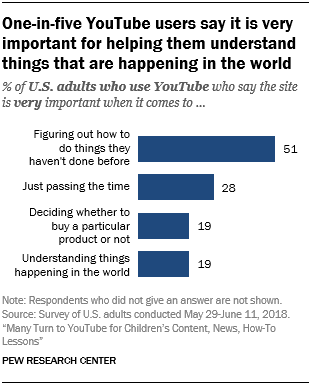
One in Five YouTube Users using it for Learning via @pewresearch and @mitchell360

Image Source: Pew Research Center.
I cam across an article "Many Turn to YouTube for Children’s Content, News, How-To Lessons" by the Pew Research Center, which shows how important YouTube is becoming for learning. Though the article is just over a year old, it is telling how valuable YouTube has become in helping people understand things that are happening in the world. The survey shows that 51% of US adults who use YouTube say it is "very important" in figuring out how to do things that they had not done before. 

Many of the things we do are only done once, or very few times. You might only need to do one thing, but in order to learn how to do it you don't want to have to sign up and pay for a full course. You just want that one piece of learning.

Many years ago I had a conversation with the then CEO of Learning Productions: Scott Mitchell. This conversation took place some time in the year 2000. He pictured a platform where content developers could create content and make it available on-line for learners to use at any time. He imagined a learning wall where each brick was a piece of content that matched a learning objective. Content developers could choose what to develop and fill in blanks where necessary. More than one developer could create content for a learning objective. Users would comment and rate content so that the good stuff would get to the top. Developers would be paid for their work dependent on the number of times their content was used. This conversation/vision took place five years before YouTube was created. Little did I know it at the time, but YouTube would end up being a close match for what Scott had envisaged. What a pity we didn't build the platform - we could have been multi-millionaires selling it later to Google!

Thursday, February 06, 2020

I Didn't Think I Was a Senior...

Image source: Amazon.
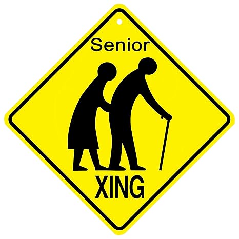
Earlier today I was in the Bord Gáis Energy Theatre to purchase tickets for Blood Brothers later this month. I go to the Box Office rather than buying on-line because it saves a lot. I was asked by the attendant if the tickets were for "children", "adults", or "seniors". Having turned 60 last October, I chanced my arm and asked "What is the age for Seniors?" - her reply was "60"! Tickets for seniors are available at a €5 discount. 

This was the first time I availed of a senior's discount. While of course I'm pleased to have saved €5, I have no real idea yet about what it means to be a senior. I saw on Sunday in Woodies DIY that discounts for seniors are available on Thursdays, and I am also already being targeted on-line with ads for older people. 

I am now a (young) Senior - it's official!

Wednesday, February 05, 2020

Good News for YouTube Content Developers

Financial results for Google (Alphabet) for 2019 tell us more about YouTube earnings from advertising than before. Revenue from YouTube ads amounted to $15.15 billion in 2019 - up considerably from the previous two years. This is good news for me and other content developers using the YouTube platform to publish our videos (and allow YouTube to serve ads on them). The graphic below shows the growth in revenue over the past three years:

Infographic: YouTube: Surging Ad Revenue Figures Revealed | Statista You will find more infographics at Statista.

I can see this effect on my own channel. In 2018 there were 3,473,515 views on my channel, but this decreased to 3,159,607 in 2019 - a considerable decrease of 313,908 views (9% approx). However, in the same time my revenue grew by about 35% (approx). Long may this continue!

What it does show is that there is money to be made from YouTube. I don't earn anything close enough to an annual salary, but it is a nice top-up on the salary that I already earn. I don't know the exact figures, but I understand the breakdown in revenue that YouTube takes about 45c in every dollar, leaving 55c for creators. So if YouTube makes money, so do the creators.

So I encourage developers to try out the YouTube platform - you may not become a millionaire overnight, but even if it is just pocket money it's a nice way to get a little extra income. Do be aware that getting people to watch your video is not easy!

Friday, January 31, 2020

The Land of Milk and Honey - Brexitland

So - the UK leaves the European Union this evening, and presumably the milk and honey will start to flow tomorrow. Good luck to them. I do feel sorry for the 16 million who voted to remain, including majorities in Scotland and Northern Ireland who wanted to remain. I doubt that my life will change one bit as a result of this, but I do worry about the Border and what unintended consequences of leaving the EU might throw up.

Image source: The Courier.

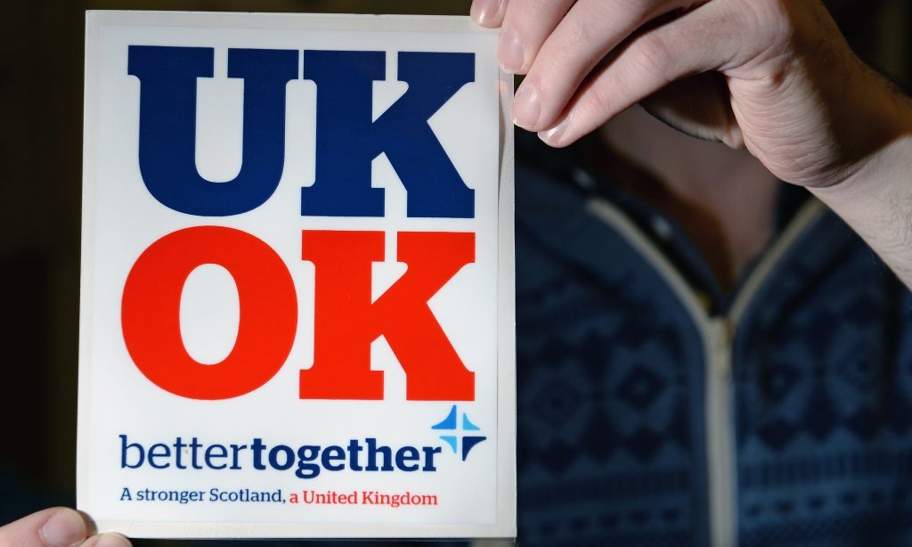
All through the Brexit debate I have followed events with a mixture of bewilderment and disbelief - I still don't understand the decision to leave. In the 2014 Scottish Independence Referendum, people fought in on the basis of "Better Together". These same folks are now telling us that we are "Better Apart". At least the bitching and moaning about Europe that has been going on for years in Britain will stop. They want a trade deal with us despite the fact that they already had a deal that will have been far better than anything they can get in a new deal.

I wish Britain well for the future, but I will not miss you.

Wednesday, January 29, 2020

New YouTube Video: How To... Embed a YouTube Video into a Google Slides Presentation

It is just over five months since I last published a "How To..." video on YouTube - I feel it is time to do another. Last week I attended a presentation where the presenter played a video embedded in a slide. I know that it is not possible to do this in Microsoft PowerPoint, so I asked the presenter how did he do it. It turns out that he used Google Slides - no surprise that Google allows embedded video on its own presentation software, and not Microsoft's. So if you are a PowerPoint user, it is easy to switch to Google Slides for a presentation to embed a YouTube video (Google account required).

Embedding a YouTube presentation in Google Slides turns out to be very easy to do. So I made a short video showing the step-by-step procedure to do this. Here it is, enjoy:

Friday, January 24, 2020

A Simple Post Value Add to a Class

This week, I did something that I never did before in my 18 years of teaching in the College! I sent an email (via our Content Management System: Moodle) to my on-line class summarising all that we had covered in the previous evening's class. Even though it was the first week of the new semester, and it was also the first week for my students who were just starting their course this January - I was surprised at how much we had covered.

The module is a programming module, for many students it was their first time writing any code. Here's is (part of) what I sent to my class the next day:

Following last evening's class, you should be able to do the following (which is a lot for your first day!):
  1. Install R
  2. Install and run RStudio
  3. Explore the RStudio interface (4 quadrants)
  4. Create and save a new R script
  5. Use hashtags to insert comments/note in an R script
  6. Display a simple message in the console ("Hello World")
  7. Navigate and Set your Working Directory every time you start RStudio
  8. Watch out for syntax errors (the typos of programming) - as you have already found out, a misplaced comma can cause havoc
  9. Try to make sense of error messages so that you can fix code that does not work
  10. Use functions - we used print(), read.csv(), head(), tail(), plot(), and ggplot()
  11. Install an R library (we installed ggplot2)
  12. Run/load an R library
  13. Open a file (.CSV) in R and display its contents
  14. Read the contents of a file into a vector (diamondData in our example)
  15. Use R to refer to individual variables (eg, "carat" in the diamondData file)
  16. Be a programmer!
This is not an innovative thing to do - it's very simple, and I'm sure many other educators already do this. I chose to do this the day after to try and motivate students who were subjected to a four hour class in which many had frustrating technical difficulties, plus of course plenty of errors that first time programmers always get. I felt that a "look what you have done already..." message might be useful (as well as motivating) for them.

But when I was compiling the list, I think I'm probably the most surprised person - it is only when I see a list like this that I realise that far from being an introductory class, we did actually cover a lot of material. Obviously, I could put this on a slide for review at the end of a class, but I think that a separate communication rather than a simple slide works better - especially for on-line students. Hopefully I will do a few more of these in future classes.

Monday, January 20, 2020

A New Semester

Later this evening I will be delivering my first class of the new semester - a class on Advanced Business Data Analysis to students on the Higher Diploma in Data Analytics. Most of my teaching now is with H Dip students - I also have final year students for Statistics. The previous semester is not yet over in that there are still some exam processing to complete. I always look forward to semester II - the days get longer and we come out of the dreary winter, and of course there is the end of the semester to look forward to ahead of the summer holidays. The semester is also stretched out a little bit with reading weeks around St Patrick's Day and Easter.

At this stage in their course, students should be well settled in to their studies. On a one year course like the Higher Diploma in Data Analytics - students are half-way through, and are hopefully motivated to stick it out to completion. During semester I, we lost some students who, for a variety of reasons, have dropped out. There seems to be no clear reason why students drop out, but only this morning I got another email from a student announcing that while he liked the course, he was dropping out due to work commitments and a change of job. We also have new students starting out, some of whom I will have for my Programming for Big Data on-line class next Wednesday. It is always nice to meet new students - on day one everybody is very motivated and keen to get started. Many have dreams of changing careers and getting into the Big Data world, starting something new, getting a new job, earning more money, and learning lots of new skills. It can be a daunting prospect for many to be back at College after many years. Attending lectures, completing assignments, studying and preparing for exams, takes serious commitment - especially for those who are also working during the day.

So - to both continuing and new students, welcome to semester II. I do hope it will be an enjoyable learning experience for you. It's likely to be my last semester, so I hope to also enjoy it as both a learning and teaching experience.

Monday, January 06, 2020

0.3% - UK Statistic of the Decade via @guardian #Analytics

Just before Christmas, in an article entitled "Don’t glaze over. This statistic holds the key to UK prosperity" by Hetan Shah in the Guardian newspaper it was reported that "Productivity growth has fallen to 0.3% ", and that The Guardian had "named it the statistic of the decade". Shah writes that productivity in the past 10 years has been "truly terrible". Before the financial crisis productivity in the UK was growing at around 2% each year, but in the last decade that has slumped to an average growth of 0.3% a year. As Shah states - the end of decade report should be that the UK "must try harder".

When compared to Ireland, the UK's productivity is lower, as measured by "Nominal labour productivity per person" (Source: eurostat). Here's a plot of figures for 2010 - 2018 for both countries:


This shows that actual productivity in the UK has been static, while Ireland has recovered considerably since the aftermath of the financial crisis of 2008. Figures for 2019 are not available on the eurostat site - the impact of all the political uncertainty of 2019 is not included.

What above tells us is that productivity in the UK has hardly changed at all over the past decade - it was the same in 2017 and 2018, after the 2016 Brexit referendum. Indeed it is not much changed since 2010 - long before a Brexit referendum was even proposed. Whats all this Brexit fuss about?

Friday, January 03, 2020

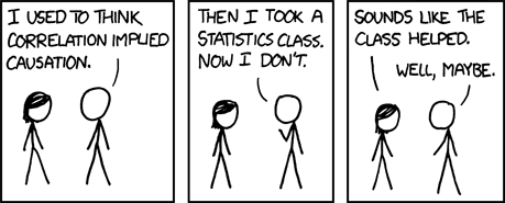
Correlation is not Causation #Analytics

A mantra that data analysts/scientist learn very early on is "Correlation is not causation". Measuring the strength of a correlation is usually done using Pearson's or Spearman's Correlation Coefficient (values between -1 and +1). These measures simply tell us whether two variables are related to each other or not. Even if we get a value as high as 0.9 (a strong positive correlation), we still cannot say that a change in one variable is dependent on change in the other. Causation is not established. 

For any two correlated events A and B, the following four relationships are possible:

  1. A causes B
  2. B causes A
  3. A and B are consequences of a common cause, but do not cause each other
  4. There is no connection between A and B, the correlation is coincidental

So what should we do? If a correlation is established, then further investigation is needed to see if there is also a causal relationship. To do this we need a controlled study in the form of an experiment. For example, as you drink more coffee, the number of hours you stay awake increases (see a great list of Common Correlations here). An experiment to test if there is a causal relationship would be easy to set up, for example - get volunteers to drink different amounts of coffee (measured by the same cup size) and time how long they stay awake. It would be important here to have a control group who do not drink any coffee. This experiment should provide strong evidence that there is a causal relationship between drinking coffee and staying awake. 

Image source: https://www.explainxkcd.com/wiki/index.php/552:_Correlation

Statistics is not an exact science, mostly because we are dealing with samples instead of populations. While we can be 95% or 99% confident of a correct result, we cannot say 100% - there is always uncertainty. Comparing two variables also involves uncertainty as we are usually also dealing with samples. Be careful with experimental design, as any bias or non-random sampling will compromise your research work.

Tuesday, December 31, 2019

2019 is dead, long live 2020!

So - 2019 is almost over and 2020 is upon us. A new decade begins - this will be my eight decade, which makes me feel old despite only catching the last three months of the 1950s. A quick look back on the year of 2019:

Highlight of the Year
No contest here - this was the trip with Roma and a great bunch of bikers across the 2,848 miles of Route 66 from Chicago to Los Angeles in July. For 14 days we rode our Harley-Davidsons on Main Street America, and enjoyed every second of it. We got to see lots of iconic American sites - the highlights being: the Grand Canyon, Cadillac Range, a corner in Winslow, Arizona, Oatman, Joshua Tree and Petrified Forest parks, and much more. Definitely the trip of a lifetime, but I hope to get a few more of these in for what's left of my lifetime.

Educational Highlight of the Year
In January last I delivered my second module on-line. I really enjoyed this experience and felt comfortable in this environment. I will be doing so again this January (R Programming module) and I find that every time I do it, I get a bit better at teaching in the on-line environment. 

Entertainment Highlight of the Year
40 years after the movie was released, I finally got to see Grease. While I was familiar with a lot of the songs, many I heard for the first time. I did not know the story line - so it was a great evening's entertainment. Hopefully I can get to more shows in 2020.

Technical Highlight of the Year
No doubt about this - I got a Google Pixel 3a phone during the summer, and it is the best phone I ever had (after several iPhones). It just does everything, and of course is the perfect companion for anyone like me who uses a lot of Google's tools and features. Recommended.

YouTube Highlight of the Year
In mid October, my YouTube channel passed the 20,000,000 views landmark figure. Despite getting an official warning from Google/YouTube for violating their terms and conditions, it was still a good year. Views were down on 2018, but revenue and subscriber subscriptions were up. Lots of plans for this channel next year!

Turning 60
I don't feel like I am 60 years old, but on October 7th last - I did turn 60. If I get the "four score years and ten" life allowance, I have three of my four scores already used up. No regrets over the past 60 years, and I look forward to another score plus ten. It has, however, made me think about how to spend the rest of my days - the big plan is to retire in late 2020 and to enjoy myself travelling. There's a whole world out there to see, and I intend to see it. 

Roll on 2020!