Thursday, April 30, 2020

Getting Bored of People Stating the Obvious

"Unprecedented", "things will never be the same", "Covid-19 is a deadly virus", "these are uncertain times", "wash your hands", "the safety of our customers is our highest priority" - I am getting fed up hearing people stating the obvious. We already know all this - but why do people online, in meetings, in calls, in the media feel the need to say this stuff over and over? 

Also, there has been an increase in the level of moaning about what will happen after the lockdown is ended. Nobody knows for sure, but that doesn't stop some people falling onto a "What have the Government ever done for us" trance.

Here's an example from yesterday's Irish Times, where Éanna Ó Caollaí and Carl O'Brien report that "University lecturers warn of ‘enrolment chaos’ in autumn". Like - has no one in the Department of Education not already thought of this? The Irish Federation of University Teachers (which I am not a member of) is warning us that the Government must begin consulting with colleges, staff and students in order to avoid escalating uncertainty and the threat of “enrolment chaos” in the autumn, and that students and university teachers are being left in an “ongoing limbo” amid the uncertainty caused by the coronavirus pandemic.

Well d'uh!

Universities and Colleges are already aware that there is a pandemic on - I know this 'cos I work in one. Ó Caollaí and O'Brien do report in their article there are actually discussions taking place. I know that in my own College that several discussions and projections have already taken place. Yet - we have to endure more warnings stating the obvious that something must be done. IFUT is demanding that they need clear and detailed discussion on a roadmap from Government on issues like when and how colleges will be allowed to reopen in a time when we have an interim Government who not surprisingly are focussing on saving lives.

Rant over.

Wednesday, April 29, 2020

Assignments replacing exams

So far, I'm not a big fan of the situation that Covid-19 has forced us all into replacing end of semester  exams with assignments/projects. Exams designed to assess learning outcomes are not being used, and it has not been easy coming up with replacements in the form of an assignment to to the same thing. Add in the fact that we had to create replacement assessments in a short time, I feel as though this situation is not ideal. But, it is-what-it-is! 

Replacing exams with assignments has an impact for educators grading them. It takes a lot longer! Most students will write between 8 - 12 pages during a two hour exam. Some who perform badly in an exam, may only write a few pages - these scripts take just a few minutes to grade. Very few will write 20/30/40 pages. But this is what I am getting with the replacement assignments - and the time taken to review and grade is very lengthy. This will inevitably put pressure on deadlines for us to get results published. 

No doubt there will be a sector review of assessment. Simply substituting an assignment (which we have had to do for obvious reasons) for an exam is a crude mechanism not designed for assessment. Assessment needs to be carefully planned regardless of whether it is an assignment or an exam. Students should be assured that no matter what mechanism is used, they are being assessed in a fair and sure manner. 

Friday, April 24, 2020

What Flattening the Covid-19 Curve is Starting to Look Like

Data published daily by the European Centre for Disease Prevention and Control allows us to examine Covid-19 data ourselves - Data Democracy in action! There has been much talk over the past few weeks about "flattening the curve", and how important following the HSE's guidelines on staying safe can help to do this. We are all praying and hoping that the feckin' curve will revert to zero quickly, but flattening also means that we prolong the infection. 

I think we can at last see evidence that the curve is flattening. Here's a bar chart showing daily reported new cases in Ireland since 1st March when the first case was reported here:

Click/Tap to Enlarge.
While the curve is not smooth, we can definitely see the slow growth in the number of cases since the first one was recorded, followed by a downward trend over the past few days. However, yesterday's new cases figure (631) bucks the trend and shows us how easy it is for the curve to start to go up again. Based on the shape of the curve above, it will take at least 3 to 4 weeks more from today before the curve reaches less than 200 new cases per day. A sobering thought given cries for the lockdown to be eased on 5th May!


Thursday, April 23, 2020

Last Class of Semester

It's always a weird feeling when I reach the last class in a semester. Last evening I held my final class on the "Programming for Big Data" module which is part of our on-line Higher Diploma in Data Analytics course. This course was delivered on-line from the beginning, so it is not one of our courses that had to switch from the classroom to on-line. 

Finishing up a module is always tinged with a little sadness for me, especially at the end of the academic year. In most cases it means that I will not see students again, I do like to get to know them throughout the semester. Finishing a semester in April also usually means for academics that their next class is in September - five months away! The next 6-8 weeks are really busy ones with grading and Exam Boards - so no slacking allowed yet.

This semester was my 36th at the National College of Ireland, and perhaps with the Covid-19 crisis to deal with, it was a semester like no other. For the last five weeks of the semester, I and my students have not set foot in the College - all our dealings have been on-line. Traditional barriers like 9 to 5 availability are broken and gone - hopefully forever. Working from home has meant that I have started work some mornings before 07:00, done work on Saturdays and Sundays, finished early or late, and taken lunch breaks longer that an hour. Never before have I had my work email open at all times (I use Outlook for this, and Gmail for private mail) - usually I used to try my best to keep the distinction between the workplace and home. There's no such distinction any more. 

We can only speculate if next September will see a return to what we had before. Will we be able to pack students into a classroom or computer laboratory if social distancing is still recommended? Many lessons will have been learned over the past few weeks about Learning and Teaching in third-level. I can only hope that we learn from these lessons.

Semester II is dead, long live Semester I.

Monday, April 20, 2020

Where to find the Johns Hopkins Covid-19 Datasets #Analytics

The data repository for the 2019 Novel Coronavirus Visual Dashboard operated by the Johns Hopkins University Center for Systems Science and Engineering (JHU CSSE) is freely available at Github. JHU have become one of the Go To places on the Internet for information and data on Covid-19, and they have some wonderful dashboards and data visualizations. Lots of my data analytics students will naturally be interested doing projects on these types of data - looking for links, trends, patterns, relationships, and to build models to make predictions and classifications.

This is Data Democracy in action. Data gives us insight, and insight in turn gives us foresight, which we can act upon. I am absolutely convinced that data analysis is helping greatly in the fight against Covid-19. Together with scientific research into treating the disease and efforts to find a vaccine - data has a vital role to play.


Sunday, April 19, 2020

How To... Plot Covid-19 Cases and Deaths as Two Lines on the Same Chart

Like a lot of people I have been looking at some of the impressive charts and diagrams related to Covid-19 in the papers - epecially The Irish Times. The Time used Datawrapper to plot its charts, so I wondered how to do some of them in Excel. The chart show rising cases and rising deaths is easy to draw- once you get the knack of selecting the right data. So I made a quick video on how to draw the chart with two lines, and posted it to YouTube. Here it is...

Thursday, April 16, 2020

Four Weeks Out of the Office #wfh

It's four weeks exactly since I last set foot in my office in the College. Even that was just to collect my folders of notes so that I could deliver my remaining classes on-line from home. Now four weeks later, with at least three to go before I get back, I am missing a lot of the daily interation with students and colleagues. It is feeling more distant with each passing day. 

We are currently in the Easter Reading Week - our last week of semester II takes place next week, as welcome an end-of-semester as ever there was. However, in a month's time we will be starting semester III and we will be planning for that soon. We are also gearing up for grading assignments and projects instead of exams which will be due in over the next few weeks. 

I made a video for the NCI Marketing Department a couple of weeks ago, as part of a series with some of my colleagues, showing off my home office. This is where I am spending most of my time. It is at the front of my house and I am slowly turning into the neighbourhood watch as I see everything that happens outside on my street. 

Thursday, April 09, 2020

Interesting Dataset from 1693 #Analytics #Data

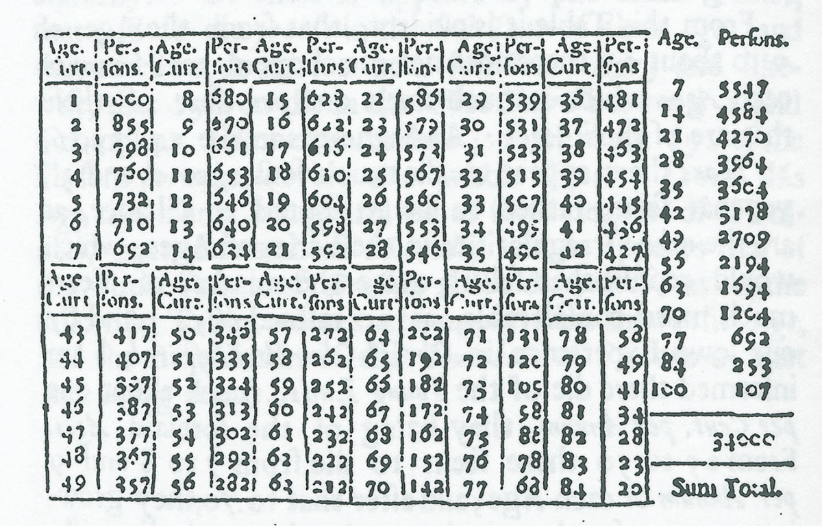
While attending a Data Analytics Institute Inspire on-line event this morning, I was particularly interested about a very old data set in the form of a Life Table. One of the presenters used this as part of the introduction. In 1693 Edmond Halley, he of Halley's Comet fame, created a life (population) table. It was based on data collected for the years 1687 - 1691 from the city of Breslau, which is now called Wrocław in Poland. The data that Halley used were the numbers of births and deaths recorded in the parish registers of the town. He was interested in debunking some superstitions about multiples of 7 - apparently people feared reaching the age of 63 (9 x 7) as it was thought to be an age at which you were more likely to die.

Here's what the original table looked like:

Edmond Halley.
Image source:
New World Encyclopedia

Wow - this is from 1693, Data Science was in its infancy! In 2011, David Bellhouse wrote a paper taking "A new look at Halley’s life table", which explains among other things how Halley used to round numbers and that the original data set is no longer available. You can see that every age from 1 to 84 is listed, and that they are presented in groups of seven. For R programmers, this dataset is available in the "HistData" library - here's the code to load the data and plot "Age" against "Persons Surviving" in stair steps format, and a plot showing the probability of surviving one more year:

library("HistData")
data(HalleyLifeTable)
#
plot(HalleyLifeTable$age, HalleyLifeTable$number, 
     main = "Halley's Life Table",
     xlab = "Age", ylab = "Number surviving",
     type = "s")
#
# Conditional probability of survival, one more year
plot(ratio ~ age, data=HalleyLifeTable, 
     main = "Halley's Life Table",
     xlab = "Age", 
     ylab = "Probability survive one more year")

The code above generates the following two charts:

Nice to be able to examine a dataset that is 327 years old!


Bellhouse, D. R. (2011) A new look at Halley’s life table. J. R. Statist. Soc. A 174, Part 3, pp. 823–832

Halley, E. (1693) An estimate of the degrees of mortality of mankind, drawn from the curious tables of births and funerals in the City of Breslaw; with an attempt to ascertain the price of annuities upon lives. Phil. Trans., 17, 596–610.

Wednesday, April 08, 2020

Using Spare Time During Lockdown

April 2020.
Last summer I got my brother Joe to cut a slice of wood from an oak tree taken from  my Dad's farm in Ballingate, Co Wicklow (where I grew up). The plan was to turn this into a coffee table for my daughter Vicki. I had never done anything like this before. The photo to the right was taken today, while the one below was taken 9 months ago in July last summer. During the fine summer holidays I spent quite a bit of time sanding it down. The timber was not completely dry, so I left in in a dry place - this caused it to crack and warp slightly. I stopped the warping by putting lead weights on top - and left it like this for most of the winter.

Throughout the winter I watched loads of YouTube videos on how to deal with cracks - there are literally hundreds showing you how to fill them with resin, which is what I ended up doing. I had to learn how to mix and pour resin - but I made quite a mess doing this (it leaked everywhere). Once it hardened it was back to sanding - lots of it. These past few weeks I was able to use my Covid-19 extended spare time to do this. Eventually yesterday I was satisfied and I painted it with Danish Oak Oil to shine it up a bit. Then I added legs (taken from another table), and et voila!

The location where the 100+ year old oak tree was felled was once part of the Coollattin Estate. Oaks from this estate were famous - it was the last native oak forest in Ireland. The estate supplied oak for the English fleet, the Stadt House in Amsterdam, Westminster Hall, Trinity College, and St Patrick's Cathedral in Dublin (see: A wonder of nature in Wicklow). I have taken many acorns from the ground near this tree and planted them successfully to replace trees like this we have felled. I am quietly pleased with myself and am happy with the result. The only problem now is that I can't travel to get more timber!
    July 2019.


Saturday, April 04, 2020

Working from home and the #NCIstayathomechallenge @ncirl @NCISport

A bit of light-heartedness never hurt anyone and the good folks NCI Sport started out to check on the College's student and staff on how they have been keeping active during this Covid-19 crisis. Check the #NCIstayathomechallenge hashtag and you see super contributions from many students as well as my academic colleagues @cormackd and @derbrad - both issuing challenges to me. I decided to make my own contribution, though it is not in the least sporty. I have not been out for a ride on my bike for three weeks, and I miss it terribly - so I had to find a way to fit it into my video.

For fun only, and not my real home office...

Friday, April 03, 2020

Covid-19 Data Sets #Analytics #Covid19

It has taken a while, but data on Covid-19 is now becoming available. While a huge amount of data obviously already exists, availability has been a different thing. Data scientists everywhere are itching to get their algorithms on these data. As stated by Jeni Tennison writing in The Guardian yesterday: "Wherever we look, there is a demand for data about Covid-19. We devour dashboards, graphs and visualisations. We want to know about the numbers of tests, cases and deaths; how many beds and ventilators are available, how many NHS workers are off sick. When information is missing, we speculate about what the government might be hiding, or fill in the gaps with anecdotes".

Now there are several sources - here's a selection that I am aware of:

Tableau
Trusted Coronavirus (COVID-19) global data from our community experts

Kaggle
Search results for search in data uploads

World Health Organisation
Database of publications on coronavirus disease (COVID-19)

UK Office of National Statistics
Registered deaths (only published on a weekly basis, and with a delay)

Citymapper 
Mobility Index using Citymapper App

1Point3Acres
Fill out a request to access their data which is aggregated from other courses

COVID-19 ITALIA
The Italians have been publishing data on Github since the beginning of March (in Italian)

The Irish Times
No data published, but excellent Corona Virus Dashboard

Sciensano
The Belgians have been publishing data at Sciensano on cases and deaths, broken down by gender and age group, and numbers of people in hospital, ICU, and receiving respiratory support

Happy data analysing everybody!

Wednesday, April 01, 2020

Why is Median Age More Important than Average Age? #Statistics #Analytics #Covid19

By the end of the Covid19 crisis, we will all become more data literate. Every day new figures are being thrown at us and we are learning new terms and expressions such as "flattening the curve". Today I want to give attention to the word "median".

The median is a measure of central tendency - it is the middle value of a data set when it is ranked from lowest to highest (or vice versa). In other words, half the values in the data set are higher than the median, and half are lower. In a normal distribution of data, the median will be the same or similar to the mean (average). In 1955, R.R. Sokal and P.E. Hunter (who obviously had nothing better to do) measured the wing lengths of 100 house flies (in 0.1 mm). They found that when they plotted the results in a histogram - they had shown an almost perfectly normal distribution, which educators in statistics have been using since as an example of a perfect normal distribution. In this data set, the mean (average) is 45.5, and the median is also 45.5 - here's what the distribution looks like:

Data source: Sokal & Hunter (1955)

Now let's take a look at some Covid-19 data. We are hearing a lot about the median age of death of Covid-19 victims - why not use the mean (average)? First, let's take a look at the distribution for the ages at death of 32 males and 16 females in South Korea:

Data source: DS4C: Data Science for COVID-19 in South Korea.

You can see straight away that the shape of the histogram differs a lot from the house fly data above. This histogram tells us at a glance that more older people are dying from Covid-19 than middle aged or younger people. The mean (average) age at death is 73.6, but the median age is 75 - a good bit higher. The median gives us a clearer picture of age at death than the mean. If you use the mean as an indicator, it gives a false picture. You can see in the histogram above that the shape is skewed by one person under 40 - this one value alone lowers the mean, but has very little impact on the median.

If you would like to learn more about median values, check out my YouTube video below: