Thursday, May 28, 2020

On-line College courses are here to stay

There's no going back to the old ways - at least not completely. There are many lessons to be learned from the current Pandemic, and one of them is that classes can be delivered on line much easier than many thought. A few short weeks ago I would not have been allowed to deliver a class from home. Two of my modules were delivered in a classroom computer laboratory - these switched to on-line in the last few weeks of the semester no problem at all. In the past few days I finished grading terminal assessments which replaced exams. While I have not decided if this is a good or bad thing yet - it is complete and it will be interesting to see if overall grades match previous years.

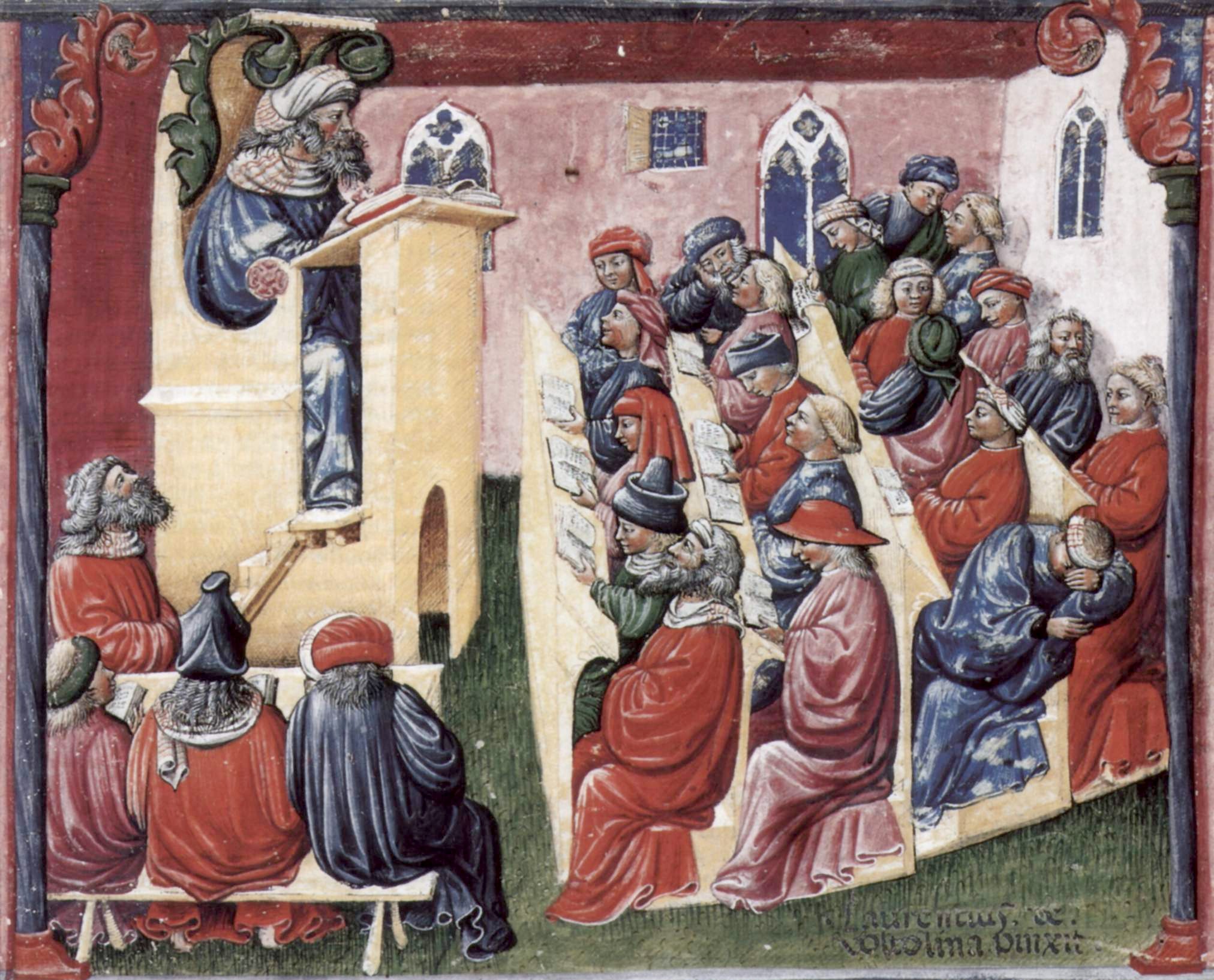
A lecture at the University of Bologna in Italy
in the mid-fourteenth century. The lecturer reads
from a text on the lectern while students in the back sleep.
Image source: Wikipedia.
Lauren Razavi, writing in The Guardian, tells us that "Students like the flexibility" that on-line universities provide. Lectures have been around for a long time, and not much has changed in hundreds of years. On-line options provide the flexibility like never before. The need to group students in a physical room for all classes is extinct.

While many of us with e-Learning backgrounds have been championing the use of technology in education for many years, we never quite got to the point of a revolution in education.  As Razavi points out in her article, the challenge now is "the scale and pace of change", and that the pandemic finally represents “a revolutionary moment".

Technology Enhanced Learning (TEL) - get used to it!

Wednesday, May 20, 2020

No more face-to-face lectures at Cambridge University until summer of 2021

News today that Cambridge University, and all its Colleges, are moving all lectures on-line for the 2020/2021 academic year. The immediate questions are: If Cambridge are doing it, should the rest of us follow? If it is good enough for a hallowed and respected institution like Cambridge - is it good enough for the rest of us?

Corpus Christi College, Cambridge.
Image source: Wikipedia.
The start of Semester I in September is just four months away - we will not be out of lockdown for another two months. The European Union coronavirus response chief,  Dr Andrea Ammon, warns us also today that "Europe should brace itself for second wave" of Covid-19 infections after people return from summer holidays. Without wishing to alarmist, I feel that more universities and colleges will follow Cambridge. I guess most third level institutions are already planning for the possibility of no return to face-to-face lectures, but pressure will grow in the next few weeks for clarity. The student accommodation crisis is with us every late summer - so prospective students will want to know where they stand (landlords too). College Faculty will also need to be ready, and will need to know several weeks in advance of a new semester whether they are teaching on-line or in a physical classroom.

I applaud Cambridge for their foresight and being first out of the blocks with this - students and staff know exactly where they stand for the coming academic year.

Wednesday, May 13, 2020

The Drive to Working from Home #wfh

Empty for years - The Seamark Building, Dublin.
Image source: CBRE.
I'm glad I am not a property developer building a new office block, or a landlord sitting on an empty building right now. I am wondering if some companies who are considering expanding their workforce still feel the need to rent/buy new offices. Perhaps there is even another property crash ahead? Some offices in Dublin have been empty for years already!

Twitter have announced in a company Blog Post yesterday that if their employees are "in a role and situation that enables them to work from home and they want to continue to do so forever, we will make that happen". Note the word "forever"! And this is for everyone in Twitter! The Irish Times reports today the "Google and Facebook extended their work-from-home policies into 2021. Amazon extended its work-from-home policy until at least early October". These of course are high-tech companies that have the technology to do this. It is obviously working for them right now, and this is the way they see the future. 

Image source: Information is Beautiful.
Schools and Colleges in Ireland are not expected to reopen until September - I agree with most people that this is a sensible thing to do, and hopefully this will happen at that time. But I for one am not comfortable going back into a building with hundreds of people in it at a time. I am not comfortable going into a classroom with 50 students, neither am I comfortable going into a reduced class of 10 - 15 students. On-line is more than OK by me, and I'm certain that prudent Colleges are already preparing for the possibility that classes might have to restart on-line in September.

Much of my reticence comes from now being over 60 years of age. The figures (based on Italy and UK) tell us that the over 60s are at most risk of dying if they get the infection. Compare this to 20 to 40 year olds (ages of most students) where the rate is less than 1%. Imagine working in an environment where one person has a 10% of dying, while everyone else is relatively safe at 1% if infection breaks out. The over 60s will benefit the most from new working from home policies.

I'm not ageist, but Covid-19 is.


Tuesday, May 12, 2020

Covid-19 Data Visualizations #TheBestSoFar #InformationIsBeautiful #Analytics

The excellent David McCandless has taken on the task of illustrating Covid-19 data in a very colourful and interactive way. He is author of the "Information is Beautiful" text book that is on our Reading List for the Higher Diploma in Data Analytics at NCI. While the source of the data (Johns Hopkins) is the same as that used by many other web sites (eg, The Irish Times Dashboard), McCandless's visualizations far outstrip others I have seen. the use of colour, shape, variety of charts, interactivity shows how big Data can be displayed in an interesting and effective way. Here's one of the best:

Image source: Information is Beautiful.

Choosing the right colours and shapes is an art, but it can be learned. You have to take into account the semantics of colour, what it is that you want to show, and how viewers will interact with your visualization. McCandless shows how far this can be taken to produce some wonderful visualizations - be sure to check them out.

Sunday, May 10, 2020

Places I've been to in April #Lockdown.

I allow Google Maps to keep track of my phone. I'm not too bothered about how or what they use this data for - it is often interesting to look back over a month and recollect where I have been. I am often stuck by the accuracy of this tracking, even at times telling me what shop I went into.

According to latest map - I have been to one place: Dublin. When I drill into this it show locations around where I live - I guess most others who are obeying the Lockdown will have a similar experience. Covid-19 Tracking Apps may have a role in the near future in the fight against the virus using technology similar to Google Maps. Of course not all people will have smartphones, many who do have tracking turned off - in the end it might just be a small proportion of the population who will do this. My mind is made up to get the tracking app when it becomes available - it might only be a few bytes in a vast lake of data, but every little bit helps!

Tuesday, May 05, 2020

Smoothing the Covid-19 Curve #Analytics

Lots of talk still about flattening the curve of Covid-19 infections. There now is clear evidence that the curves have flattened in many countries (see the excellent "Has the curve flattened?" page at Johns Hopkins). Much of the data is still what we call "noisy" - going up and down.

Data source: European Centre for Disease Prevention and Control.

One method that researchers use to detect trends in "noisy" data is to use a moving average to smooth the data. In the diagram above the blue line represents actual daily data for the number of confirmed new cases of Covid-19 in Ireland - as you can see it does jump up and down a bit over time, though a trend is still visible. By applying a moving average (I have used a 5-day average), the smoothing red dotted line is much clearer in displaying the downward trend since the peak in mid-April. It still has a long way to go, but let's hope that we do not see the trend going upwards again.