Most people will be aware that the city of Melbourne in Australia has endured one of the world's strictest lockdowns, but the data so far is showing that this drastic action has yielded fantastic results. In a stark lesson for those people who protest against lockdowns and face-mask wearing, the evidence is that Melbourne's early lockdown intervention serves as another lesson for people living in Dublin as to what a new (albeit moderate) lockdown will mean for us, and why early intervention is necessary.
Check out the chart below...
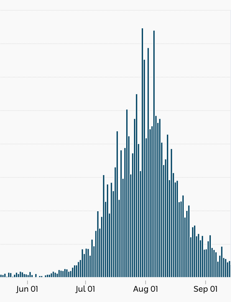
The upsurge in cases in June looks small, this was due partly to the sharing of a cigarette lighter between security guards at a hotel where international travellers were being quarantined (see: The Irish Times article "The strange tale of the cigarette lighter that spread coronavirus around a city"). However, the spread of the virus quickly got out of control, and the authorities introduced a lockdown in early July. You can see that this had little effect at first as cases still climbed, but since August they have dramatically declined. Could this happen in Dublin, a city/county about one quarter the size of Melbourne?
In my opinion, the government has no option but to renew restrictions in Dublin. This is shitty for everyone, not just for the protestors, people who deny there is a problem, or those whose personal freedom is being denied by a piece of cloth on their face. We don't want a curve with a higher peak than Melbourne's above, and the consequent higher number of deaths that will follow.
No comments:
Post a Comment