Thursday, June 18, 2015

How To... Create and Modify a Stacked Bar Chart in Excel 2013 @YouTube

Some of my most popular videos on YouTube show learners how to do some of the most basic things in Excel. However, many people are new to Excel or only use it occasionally. So if you want to do something like draw a simple bar chart and you have never done so before - it can be a little intimidating to figure out how to do it. These days many learners are more likely to go to YouTube for a "How To" video than look it up in a book/manual or take a course. In fact an astonishing 88,681 learners have viewed my How To... Draw a Simple Bar Chart in Excel 2010 to date.

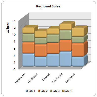
Image Source: Microsoft Office Support.
In my latest video I am showing how to create a stacked bar chart in Excel 2013. While this is very easy to do, it can be difficult to figure out what the right type of stacked bar chart to choose is. I have also added in a little extra to "jazz" the chart up a bit my showing how to make it look 3D and also to make the blocks on the chart have bevelled edges. The idea and data used for this video is taken from a Microsoft Office Support page. A stacked bar chart is ideal for comparing data in different views. The 3D Bevelled effect looks a lot better and more professional in a presentation or a report.

Here's the latest video... 

No comments:

Post a Comment